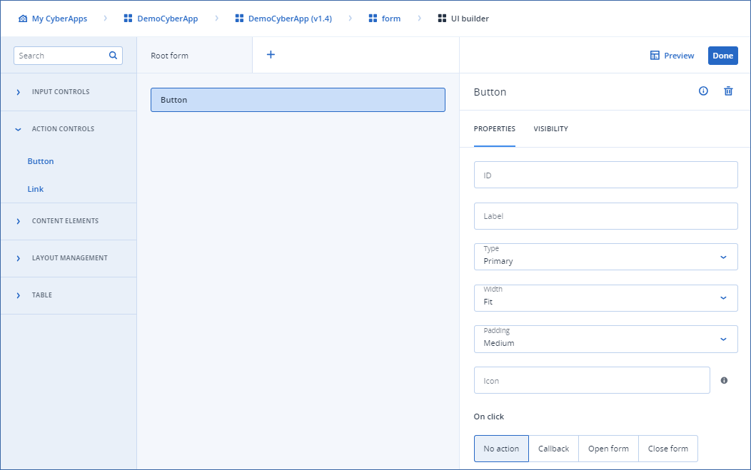
Button

This element executes an action on user click.

Important

This element is not available in Connection setup form.

Properties

  • ID
    Element identifier used to refer to in the callbacks/other areas.
  • Label
    The button label.
  • Type
    The button type. Each type has its own style.
    • Primary

    • Secondary

    • Danger

    • Ghost

    • Promo

    • Translucent

  • Width

    • Full
      Uses 100% of the available width.
    • Fit
      Adjusts the width according to the content.
  • Padding
    The padding around the button.
    • Small

    • Medium

    • Large

  • Icon
    The button icon instead of the label.
  • On click
    The action that is executed on user click.
    • No action
      The button does nothing.
    • Callback
      Execute a callback on click. You must select the callback from the dropdown.
    • Open form
      Open a form. You must select the form from the dropdown.
    • Close form
      Close the form on click.
../../../../_images/ss-uibuilder-button.png