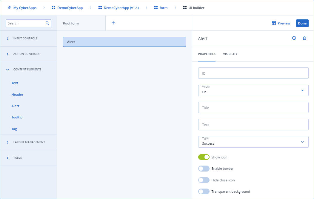
Alert

This element is a block with an admonition that requires user attention.

Properties

  • ID
    Element identifier used to refer to in the callbacks/other areas.
  • Width

    • Full
      Uses 100% of the available width.
    • Fit
      Adjusts the width according to the content.
  • Title
    The title of the alert.
  • Text
    What is displayed in the alert.
  • Type
    The alert variant. Each variant has a unique style that represents the alert context.
    • Success
      A green block that notifies the user about a successful action.
    • Warning
      A yellow block that warns the user.
    • Info
      A blue block that informs the user.
    • Error
      A red block that informs the user about a problem.
  • Show icon
    Toggle on to display the alert icon before the alert text.
  • Enable border
    Toggle on to add a border to the alert block.
    The border will have a color that corresponds to the alert type.
  • Hide close icon
    Toggle on to hide the close icon at the top right corner of the alert text.
  • Transparent background
    Toggle on for transparent background color.
../../../../_images/ss-uibuilder-alert.png