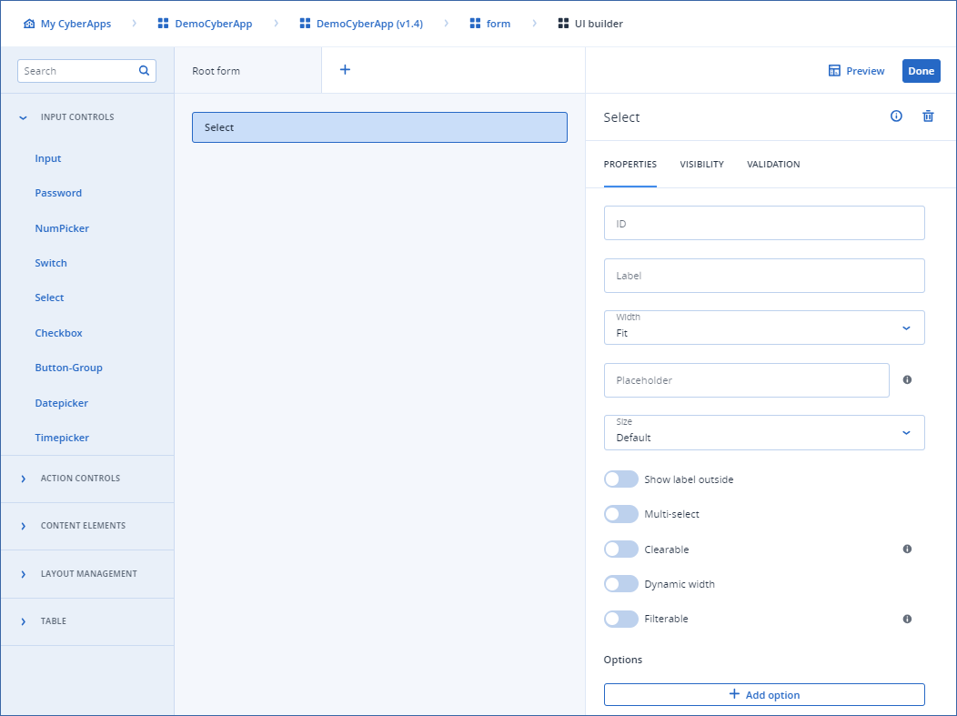
Select

This element contains a list of options. The user can select one or more.

Properties

  • ID
    Element identifier used to refer to in the callbacks/other areas.
  • Field type
    Specifies what kind of data this element represents.

    Important

    This property is only available in Connection setup form.

    • Connection settings indicates that this information will be sent to the ISV servers but does not need to uniquely identify a user and is not sensitive information that must be stored and sent in a special way.
    • Additional settings
  • Label
    Element/field name, as it appears on the UI.
  • Width

    • Fit
      Adjusts the width according to the content.
    • Full
      Uses 100% of the available width.
  • Placeholder
    The placeholder text is shown when the label is floating but the input is empty.
    It is used to give the user an additional hint about what they should type in the input.
  • Size
    • Default
      Renders larger input with the label inside.
    • Small
      Renders thinner input with the label outside.
  • Show label outside
    Enable for the element label to appear above the input.
    Otherwise, the element label appears inside the input.
  • Multi-select
    Enable to allow selection of the multiple options.
    Otherwise, only one option can be selected.
  • Clearable
    Enabled to include a pre-defined icon to clear the selected option.
  • Dynamic Width
  • Filterable
    Enabled to include search input in the options list.
  • Options
    The list of options in the selector.
    Label specifies the option label, Value specifies the option value.
../../../../_images/ss-uibuilder-select.png