Input controls
Input control elements are used to input data.
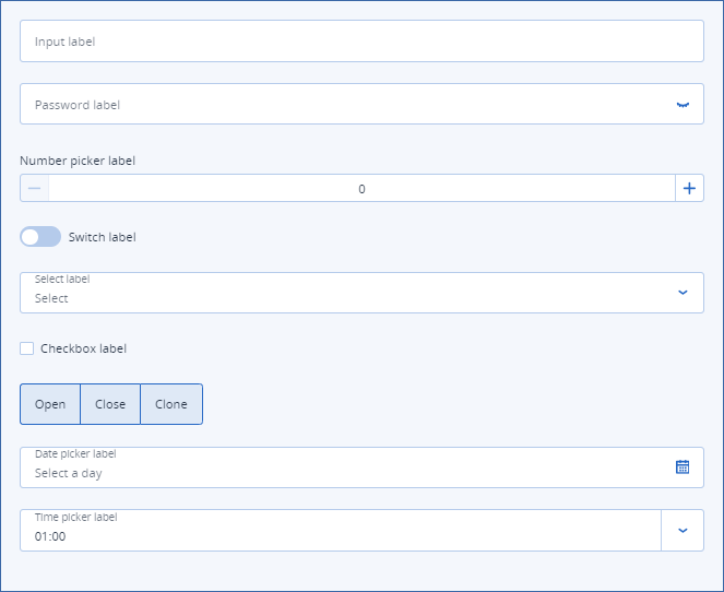
- InputA simple input field. The user inputs a single- or multi-line text, or a number.
- PasswordUsed to input private credentials, such as passwords, private keys, etc.
- NumPickerA customizable number input element.
- SwitchToggles on and off.
- SelectContains a list of options. The user selects one or more options.
- CheckboxA checkbox input.
- Button-GroupA group of buttons that can be used to select different options.
- DatepickerA calendar to pick a year, a month, a date, a range of dates, or a selection of dates.
- TimepickerAccepts a time in the
hh:mmformat.
In this section