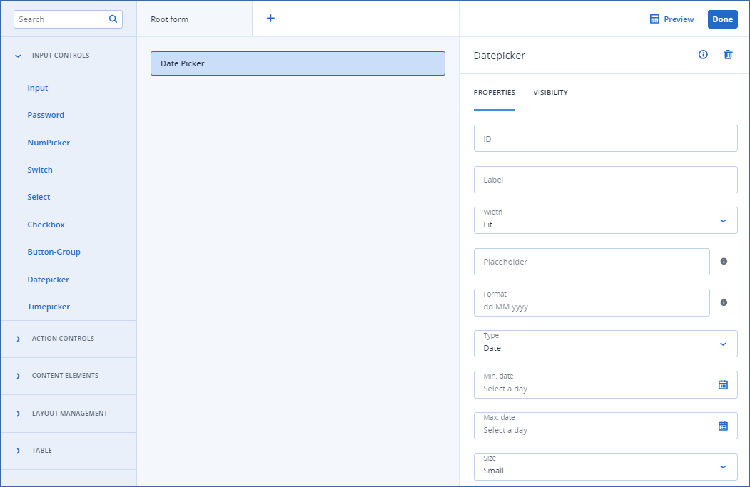
Datepicker

This element provides a calendar to pick a year, a month, a date, a range of dates, or a selection of dates.

Important

This element is not available in Connection setup form.

Properties

  • ID
    Element identifier used to refer to in the callbacks/other areas.
  • Label
    Element label, as it appears on the UI.
  • Width

    • Full
      Uses 100% of the available width.
    • Fit
      Adjusts the width according to the content.
  • Placeholder
    This is text displayed when the label is floating but the input is empty.
    It is used to give the user an additional hint about what they should input.
  • Format
    Format of the date, according to ISO 8601.
    Default is dd.MM.yyyy.
  • Type
    Type of the date picker.
    • Year
      Users select the year and the 1st of January of that year is the returned value.
    • Month
      Users select the month and the 1st of the month is the returned value.
    • Date (default)
      Users select a single day.
    • Daterange
      Users can choose a start and end date.
    • Multi
      Users can select multiple, non-consecutive dates
  • Min. date
    The earliest date that can be specified in the date picker.
  • Max. date
    The latest date that can be specified in the date picker.
  • Size
    • Default
      Renders larger input with the label inside.
    • Small (default)
      Renders thinner input with the label outside.
../../../../_images/ss-uibuilder-datepicker.png