Group
Groups allow you to group multiple elements together to control the visibility settings of multiple elements as a single group.
To use a group, drag and drop elements into them.
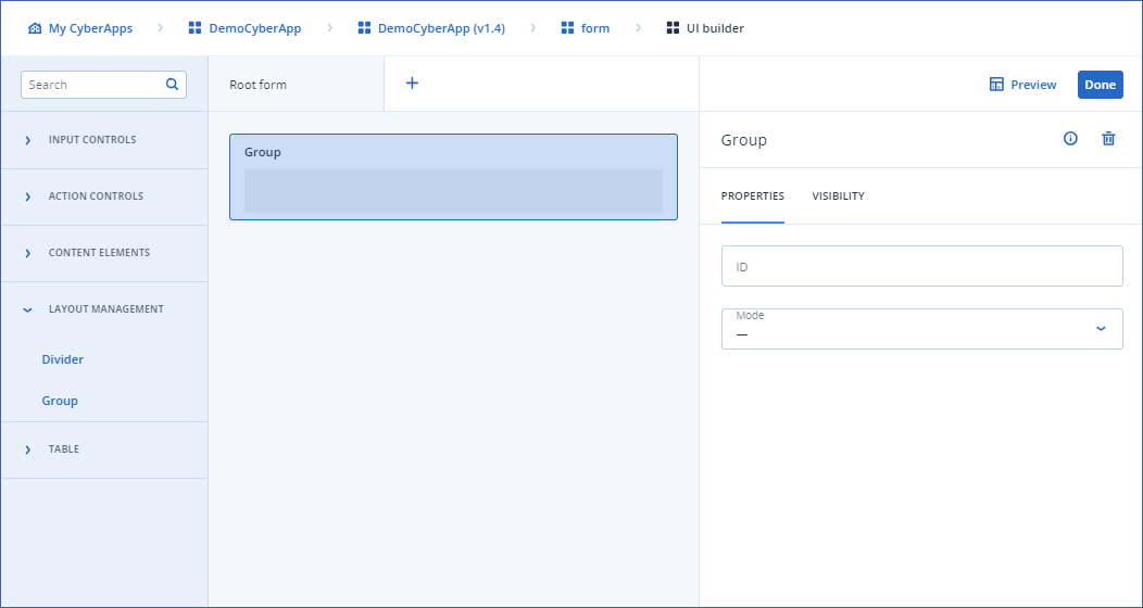
There are 3 group modes.
Note
Currently, the preview for a row group mode shows no padding between elements. However, in production, padding will be added. This is a known bug in the preview.
Repeater example
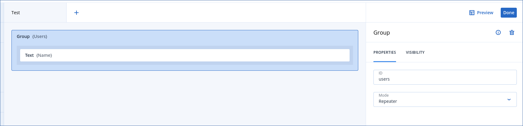
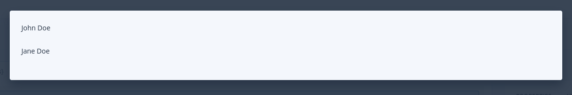
This form contains a group element with ID
users, in Repeater mode.Inside the group element, there’s a text component with ID
name.In the preview, it will render nothing:

This is because, by default, the form’s model is empty, and there’s no array with the key
users, which is the key assigned to the group repeater.However, if we assign this object to the form’s model:
Note
This is currently not possible to do in the preview.You would need to use callback mapping to accomplish this.
{"users":
  [
    {
      "name": "John Doe"
    },
    {
      "name": "Jane Doe"
    }
  ]
}
We would display something which looks like we added two groups with Row mode and a text inside.