Line chart
A line chart plots one or more historical data sets as points on one or more graphs. You must supply the chart data in a callback response, and map the callback response to the line chart element in the Data Initializer callback section of the form’s PROPERTIES tab. For more information, see Specifying a data initializer callback.
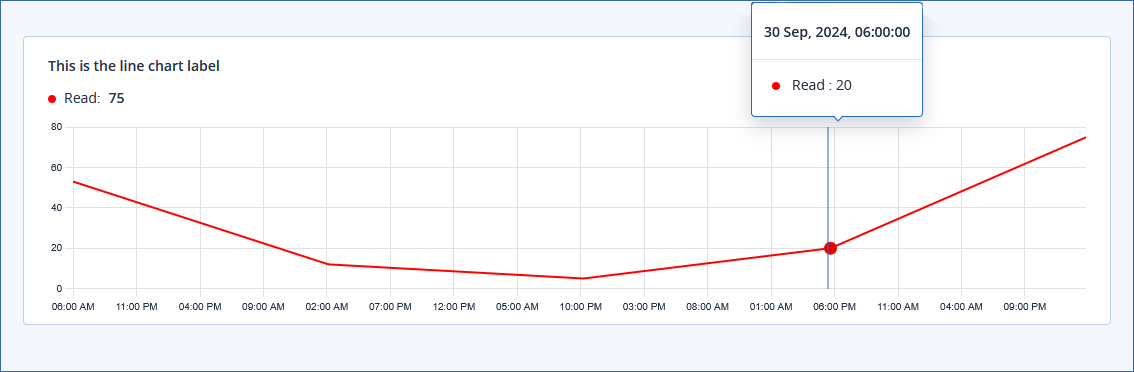
In the example below, you can see a line chart with a label, a single data set rendered in red, X axis time unit of hours, data points shown on user hover, and data point tooltips. For more information, see PROPERTIES.
Line charts have a default appearance, but you can override the appearance defaults in the element PROPERTIES tab. You can also dynamically override the properties in the line chart callback response. For more information, see JSON schema of line chart callback response.
Note
You can periodically refresh the line chart data (and appearance, should you wish to) by specifying the appropriate callback in the Refresh callback section of the form PROPERTIES tab, and mapping the response data to the line chart element properties. For more information, see Refresh callback.
PROPERTIES
Second
Minute
Hour
Day
Week
Month
Year
Default = Hour.
Note
This property cannot be controlled using chart callback response data.
JSON schema of line chart callback response
{
  "title": "Line Chart",
  "description": "Line Chart data payload",
  "type": "object",
  "properties": {
    "data": {
      "type": "object",
      "properties": {
        "series": {
          "type": "array",
          "items": {
            "type": "object",
            "properties": {
             "name": {
                "type": "string"
              },
              "points": {
                "type": "array",
                "items": {
                  "type": "number"
                }
              }
            }
          }
        },
        "labels": {
          "type": "array",
          "items": {
            "type": "string"
          }
        }
      }
    },
    "legend": {
      "type": "boolean",
      "default": true,
      "description": "Toggle visibility of legend"
    },
    "dataPointOnHover": {
      "type": "boolean",
      "default": false,
      "description": "Show data points on hover"
    },
    "precision": {
      "type": "integer",
      "default": 0,
      "description": "Number of digits to be shown after decimal point"
    },
    "showDataTypeUnit": {
      "type": "boolean",
      "default": false,
      "description": "Show data type unit with time unit"
    },
    "stepped": {
      "type": "boolean",
      "default": false,
      "description": "Toggles stepped nature of line"
    },
    "tooltip": {
      "type": "boolean",
      "default": true,
      "description": "Toggles visibility of tooltip"
    },
    "tooltipTimeFormat": {
      "type": "string",
      "default": "dd MMM, yyyy, hh:mm:ss",
      "description": "Format of time displayed in tooltip"
    },
    "variableThreshold": {
      "type": "boolean",
      "default": false,
      "description": "Toggles if variable threshold values are passed"
    },
    "xAxis": {
      "type": "boolean",
      "default": true,
      "description": "Toggle visibility of x-axis"
    },
    "xGrid": {
      "type": "boolean",
      "default": true,
      "description": "Toggles visibility of vertical grid lines"
    },
    "yAxis": {
      "type": "boolean",
      "default": true,
      "description": "Toggle visibility of y-axis"
    },
    "yGrid": {
      "type": "boolean",
      "default": true,
      "description": "Toggles visibility of horizontal grid lines"
    },
    "yAxisStepSize": {
      "type": "integer",
      "description": "Defines the step size on the Y axis"
    },
    "yAxisTicksUpperLimit": {
      "type": "integer",
      "default": 5,
      "description": "Upper limit for the number of ticks displayed on the Y axis"
    },
    "yPercent": {
      "type": "boolean",
      "default": false,
      "description": "Toggles if values are to be rendered as percentages"
    }
  },
  "required": [
    "data"
  ]
}