Element distribution
This section describes the factors which affect the relative distribution of CyberApp UI elements within forms and container elements such as groups, tooltips, tables, and tab containers.
Every type of element - including forms and the container elements (groups, tooltips, tables, and tab containers) - consists of two parts: the visible content and an invisible element container around it. The element Width property and spacing settings control element distribution. For more information on spacing, ee the Adjusting element spacing chapter.
The Width property
Element Width property primarily controls the element container. The Width property has three possible values:
Fill-responsive elements
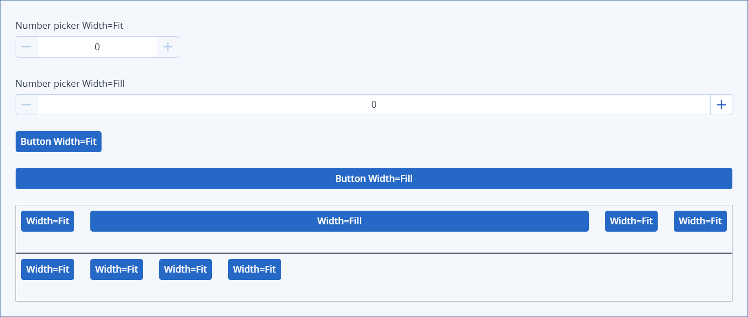
Width = Fill also affects the visible content for fill-responsive elements. The visible content of fill-responsive elements expand to match the element container when the element Width = Fill. These are the fill-responsive elements.
These examples illustrate the concept of fill-responsive. In the final example, the group element has Width = Fill, but the four contained button elements are all Width = Fit, so they only occupy the width necessary for the visible content (the button).
Width examples for elements with unexpandable visible content
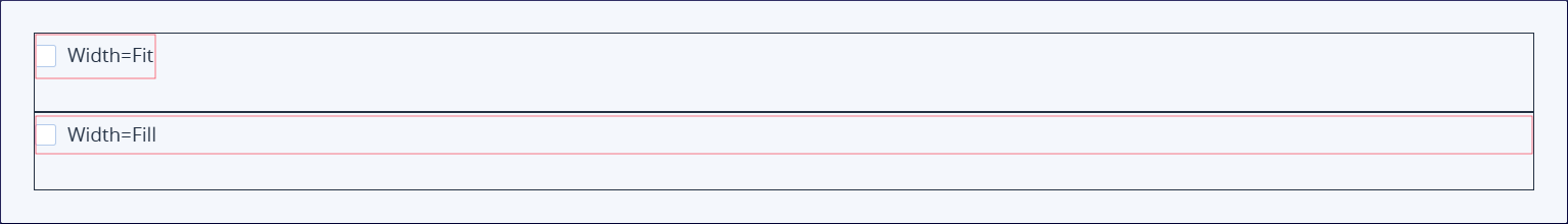
In the following two examples, the same checkbox element is displayed with Width = Fit and Width = Fill. The red boxes represent the invisible element containers. You can see that with Width = Fill, the element container expands to use all the available space (the width of the form, minus the 24 px inner left and inner right form padding).
Note
The checkbox elements have the default outer bottom margin spacing of 24 px. This is why the two checkboxes are separated vertically.
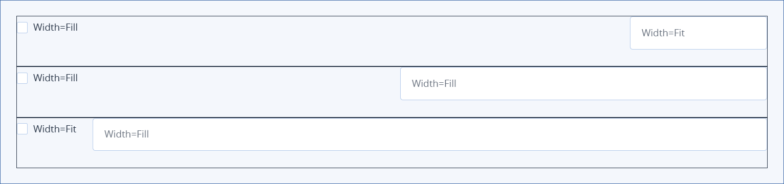
In the following three examples, a checkbox (which has unexpandable visible content) and an input element (which has expandable visual content) are contained elements of a Mode = Row group element with Width = Fill. You can see