Radio button element

newfeaturesmall

The radio button element contains a list of options which correspond to an underlying value, and optional descriptions of the options. You can manually specify a static list of options, or populate the options dynamically from a callback response array.

See examples

Properties

  • ID: is used to refer to the element in mappings, etc.

  • Field type: specifies what kind of data this element represents.

    Note

    This property is only available in the CyberApp enablement form and the Customer enablement form.

    • Connection settings: indicates that this information will be sent to the ISV servers but does not need to uniquely identify a user and is not sensitive information that must be stored and sent in a special way.
  • Label
    Optional text displayed above the radio button element.
  • Width

    • Default
      This is for backward compatibility purposes only.
    • Sets the width according to the options (see below).
    • Uses all of the available width.
      For more information, see Element distribution.
  • Layout

    See examples

    • Vertical
      This options are listed vertically.
    • Horizontal - single row
      If your options are too long to fit in the available space, a horizontal scroll bar is displayed.
    • Horizontal - multiple rows
      If your options are too long to fit in the available space, they are wrapped to another row.
  • Background section

    • Background color
      There are several options.
      Default is transparent.
  • Border section

    Note

    If you want a border for your radio button, you must to set the Top border, Bottom border, Right border and/or Left border to Solid.
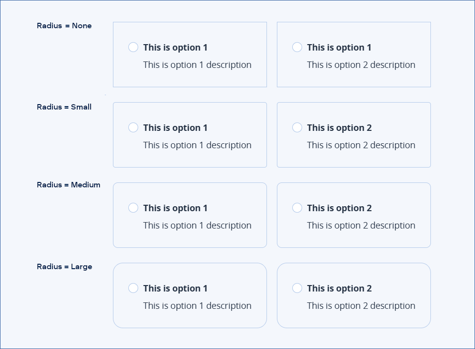
    • Border color
      There are several options.
    • Border radius
      Curvature of the border corners.

      See examples

      • Default

      • None (Default)

      • Small

      • Medium

      • Large

    • Top border, Right border, Bottom border, Left border
      These properties control the line style of the four border sections.
      • Default

      • None (Default)

      • Solid

  • Options section specifies the list of radio button options. There are two ways to specify the options:

Examples

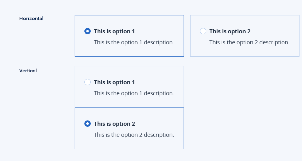
Horizontal and vertical examples

../../../../../../../_images/ss-element-radio-examples.png

Border radius examples

../../../../../../../_images/ss-element-radio-radiuseg.png