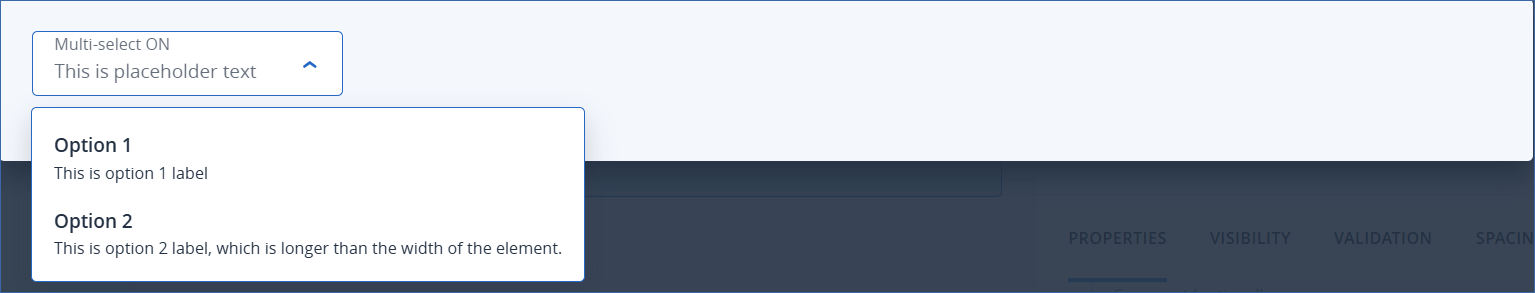
Select element
This element appears as a dropdown, containing a list of options which correspond to an underlying value, and optional descriptions of the options. You can manually specify a static list of options, or populate the dropdown dynamically from a callback response array.
Properties
ID: is used to refer to the element in mappings, etc.
Field type: specifies what kind of data this element represents.
Note
This property is only available in the CyberApp enablement form and the Customer enablement form.
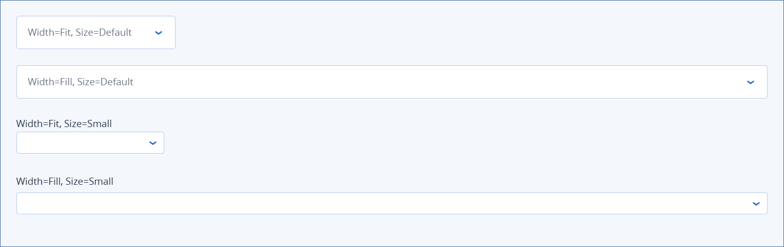
Width
Size
Tip
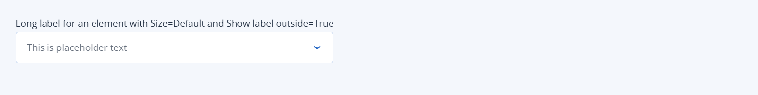
To avoid truncation of a long label for an element with Size property of Default, enable this property. The element will expand accordingly to accommodate the long label.
Note
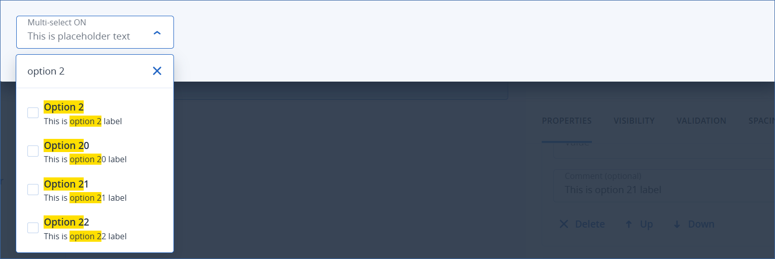
If you use a paginated callback to populate the select element options, this property is not available. If you want to allow filtering, you can use an input element, and map it to the paginated callback request.
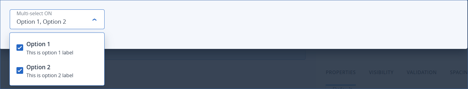
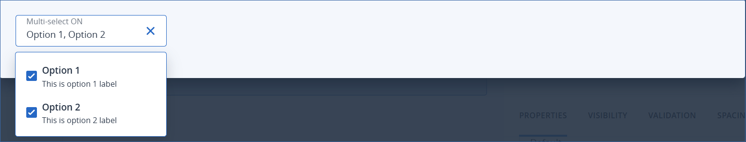
Options section specifies the list of options in the select dropdown. There are two ways to specify the select dropdown options:
Examples
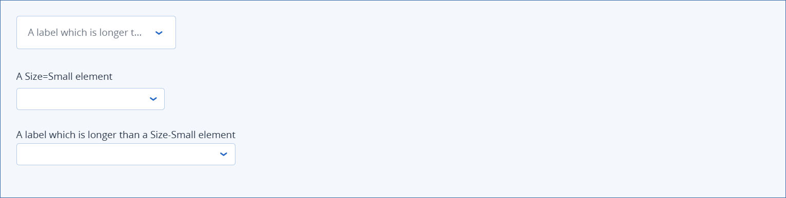
Width and size examples
Note
The text for each element example is Label property text.
Long label examples