Input element
This element is a simple input field. See the Type property, below, for details of the input types.
Properties
Note
This property is only available in the CyberApp enablement form and the Customer enablement form.
X-CyberApp-Authheader of the callback request as plain text.Connection settings indicates that this information will be sent to the ISV servers but does not need to uniquely identify a user and is not sensitive information that must be stored and sent in a special way.
Width
Size
Type
Note
You can optionally specify the minimum and maximum permitted values.
Examples
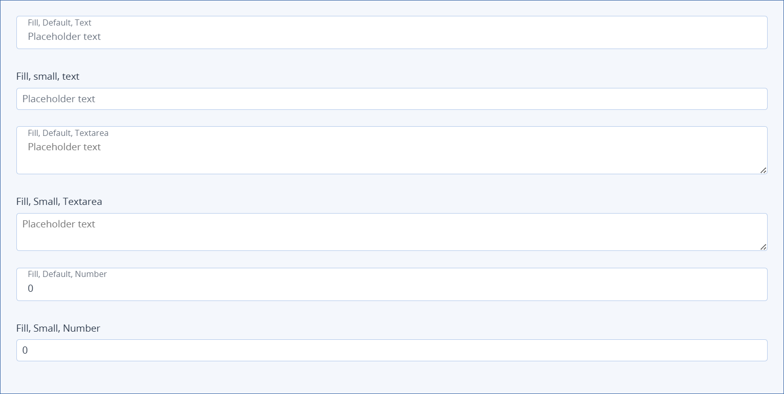
Width=Fill examples
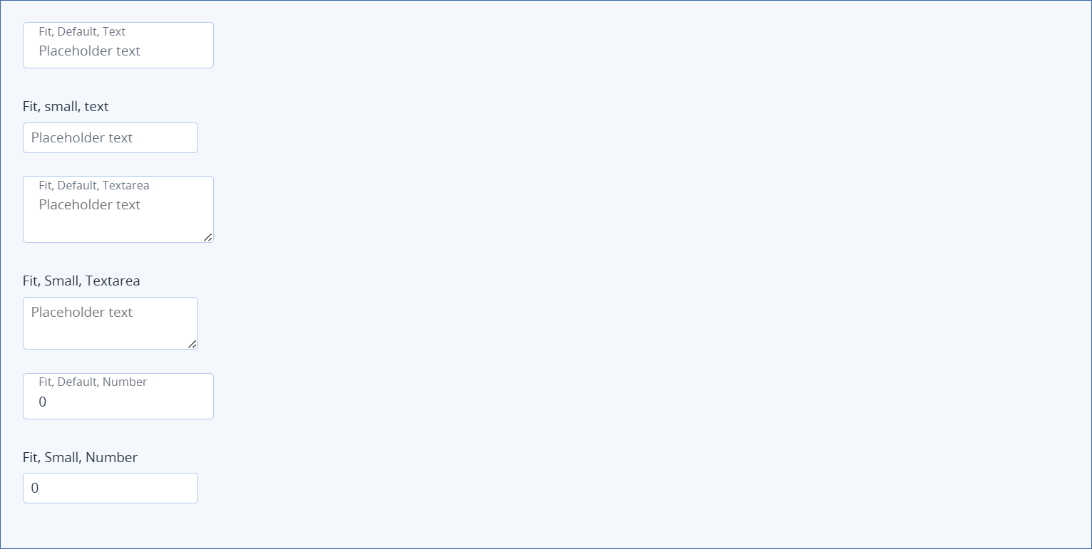
Width=Fit examples
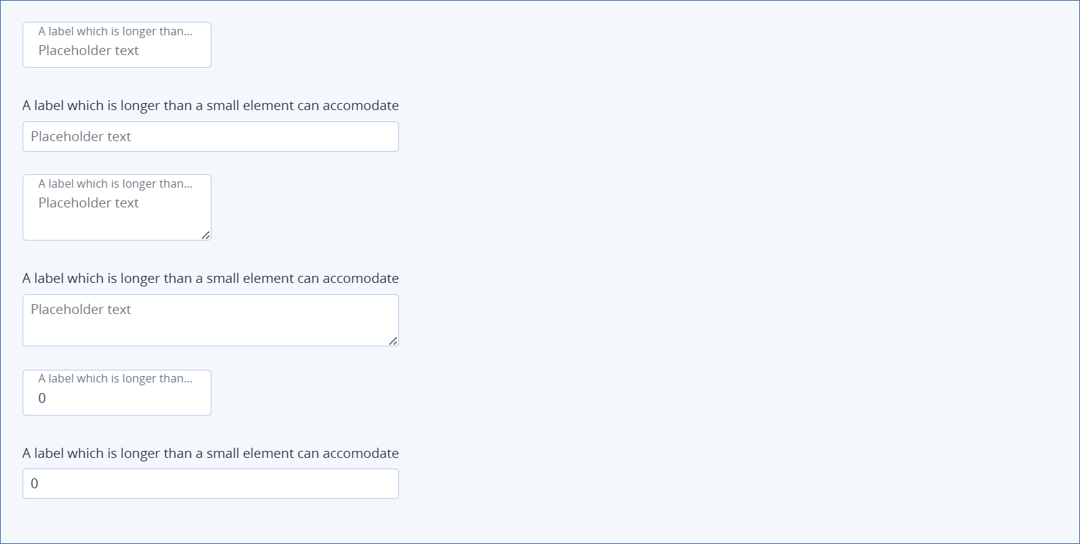
Long label examples