Table action buttons
In the Action buttons section of a table element, you can define table action buttons, which appear above the table.
You can optionally turn on the Show actions as ellipsis button options in table row toggle switch to add a table column with an ellipsis menu button, which displays the action button labels.
It also displays the  icon, which users can click to hide or display columns.
icon, which users can click to hide or display columns.To add a table action button
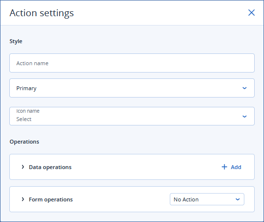
Click + New action button.
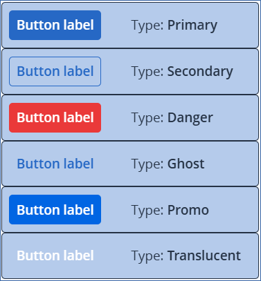
Primary
Secondary
Danger
Ghost
Promo
Translucent
Always enabled
If one row is selected
If some rows are selected
If no rows are selected
In the Operations section:
This section defines operations executed when a user clicks the action button.You can define multiple (optional) data operations and a form operation.
[Optional] Data operations
Click + Add to define a data operation.
Select the Operation type.
Repeat the previous steps for all the data operations that you want to execute when a user clicks the button.
Note
Click the trash can icon to remove a data operation.
Form operation
Select an action from the dropdown list.
Click outside the popup window to save your changes.
Note
You can reorder table action buttons by clicking and dragging the action button panel.
To delete an action button, click its trash can icon.
Each Action button panel provides a summary of the operations that you defined for the button.
Examples
Button types