Link
This element opens the specified URL on user click.
The link can present as a standard link or as a button.
Properties
- IDElement identifier.
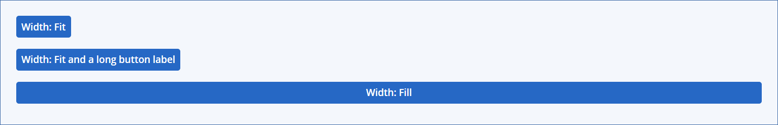
Width
- DefaultThis is for backward compatibility purposes only.
- FitAdjusts the width according to the Text contents.
- Fill (default)Uses all of the available width.A standard link is not fill-responsive.A button-style link is fill-responsive. (see examples)For more information, see Element distribution.
- TextThe link display text or button label.For more information, see the Style property, below.
Note
This property can be controlled dynamically, using a callback. For more information, see :doc:<dynamic-link>.
URL / CTI
The URL of the external page to open, or the Cross-domain Type Identifier (CTI) of an Acronis Cyber Protect Cloud menu item to redirect to.- URLAn external URL. You can add variables to the URL value. The link respects the Open in a new browser tab setting.
Note
The URL can be controlled dynamically, using a callback. For more information, see Defining a link dynamically.
- CTIA CTI identifies one of the following navigation targets:
A static menu item (for example, Devices, Alerts, or Actions). Static menu items are listed with their name in parentheses (for example,
(Devices)) to distinguish them from dynamic menu items.A menu item declared by the CyberApp.
The Integration settings tab.
A CTI redirect always opens in the same window; the Open in a new browser tab setting is ignored.Add variable is unavailable when the field contains a CTI.
- Open in a new browser tabWhen enabled, the link opens in a new browser tab. Default: off.This setting applies only to URL values. CTI redirects always open in the same window.
- Style
- Link (default)The link is displayed as a standard link.
- ButtonThe link is displayed as a button element. Additional settings are available if you chose this style:
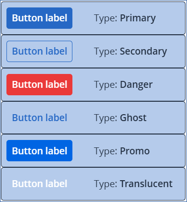
- Type (see examples)The button type. Each type has a different style.
Primary
Secondary
Danger
Ghost
Promo
Translucent
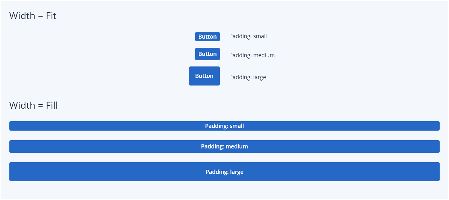
- Padding (see examples)The internal padding of the button, which determines its overall size.
Small
Medium (default)
Large
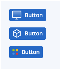
- [Optional] Icon name (see examples)Inserts an icon to the left of the label.
Note
If you select a monochrome icon, it is displayed in white.
Examples
Button types
Button width examples
Button padding examples
Button icons examples
In this section