Button
This element executes an action on user click.
Note
This element is not available in the CyberApp enablement form.
Properties
- IDElement identifier.
- LabelThe button label text.
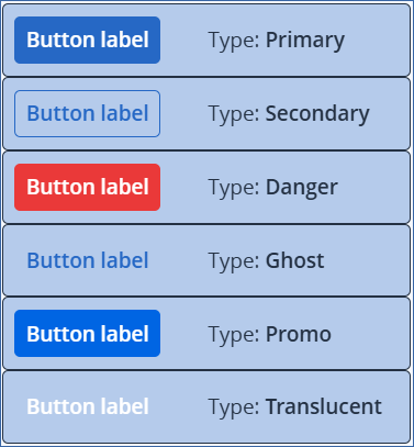
- Type (see examples)The button type. Each type has a different style.
Primary
Secondary
Danger
Ghost
Promo
Translucent
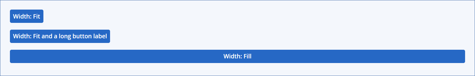
Width (see examples)
- DefaultThis is for backward compatibility purposes only.
- Fit (default)Sets the width to accommodate the label.
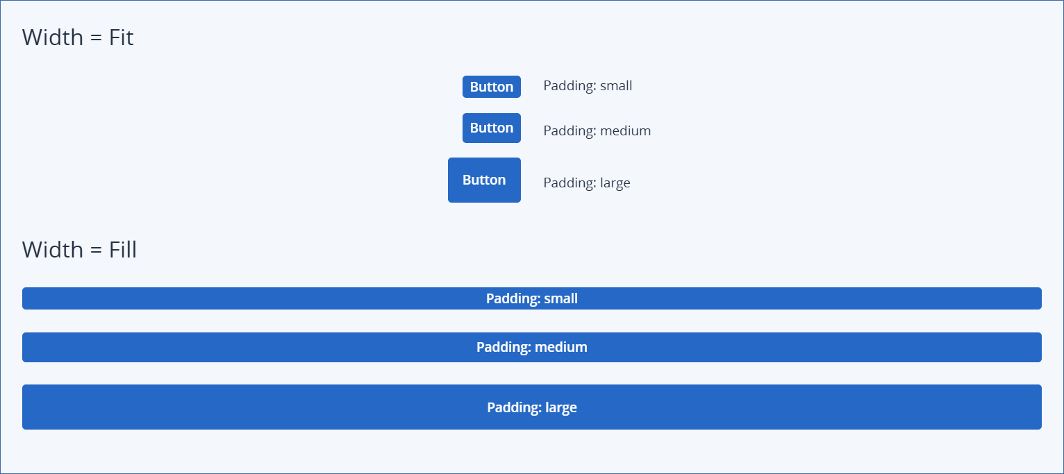
- Padding (see examples)The internal padding of the button, which determines its overall size.
Small
Medium (default)
Large
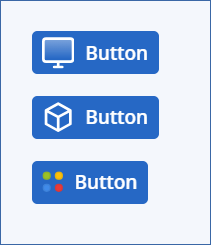
- [Optional] Icon name (see examples)Inserts an icon to the left of the label.If you select a monochrome icon, it is displayed in white. A colored icon is displayed unaltered.
- On clickOperations executed when a user clicks the button.You can define multiple (optional) data operations and a form operation.
Note
The panel provides a summary of operations that you have defined.
Click the On click panel to define or change the ‘on click’ operations.
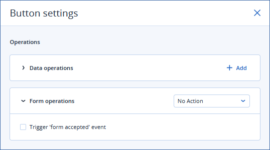
[Optional] Data operations
Click + Add to define a data operation.
Select the Operation type.
- CallbackExecutes a callback.You must select the callback from the dropdown list.
- Set parametersThis option allows you to explicitly set form element and input parameter values if the user clicks the button. A common use for this functionality is for a reset filters button without executing a callback.When you select this option, a JSON edit panel appears, where you must provide JSON to apply when the user clicks the button. The edit panel is interactive: it suggests element IDs and parameters as you type, highlights invalid IDs and parameters, and indicates invalid values.
Repeat the previous steps for all the data operations that you want to execute when a user clicks the button.
Note
Click the trash can icon to remove a data operation.
Form operation
Select an action from the dropdown list.
- No action [default]No form action is executed.Select Trigger ‘form accepted’ event to pass any defined output parameters to the parent form, and trigger the data initializer callback on the parent form.
- Open formSelect the child form Mode (Popup or Sidebar) and the child Form name to open.
- Close formCloses the current form.Select Trigger ‘form accepted’ event to pass any defined output parameters to the parent form, and trigger the data initializer callback on the parent form.
Click outside the popup window to save your changes.
Button style examples
Button types
Button width examples
Button padding examples
Button icons examples