Icon
This element is a customizable icon, chosen from an extensive, pre-defined library.
Note
For dynamic icon control based on callback response data, see Defining an icon dynamically.
Properties
Width
Note
This option is only available if you selected a monochrome icon on the previous step. Colored icons are displayed with their original color(s).

Examples
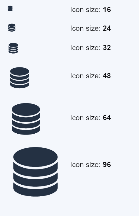
Icon size examples
Icon color examples
In this section