Tooltip
Tooltip displays an information icon associated with a single element or a row of elements. When the user hovers over the information icon, a pop-up displays the tooltip Text property contents.
Tooltip is a container element, normally with a single contained element.
Note
If there are multiple contained elements, they are displayed vertically within the tooltip element on the UI builder canvas, but are displayed horizontally when rendered in the UI.
Properties
Width
Note
For more information on basic markdown syntax, including variable substitution, see UI builder element markdown.
top
top-start
top-end
bottom
bottom-start
bottom-end
left
left-start
left-end
right
right-start
right-end
Examples
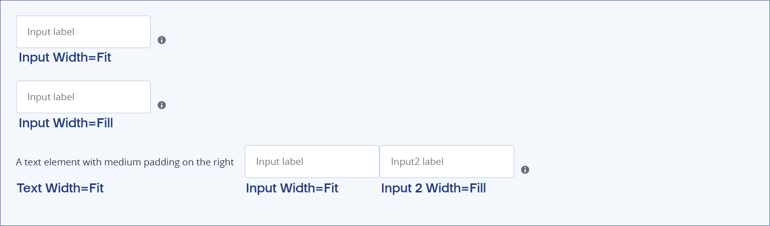
Width=Fit examples
In all three examples, the tooltip container element limits the width to the minimum required for the contained elements.
Note
In the examples, the input with Width=Fill expands to the maximum available width within the tooltip container. However, since the tooltip container Width=Fit, the available space is limited.
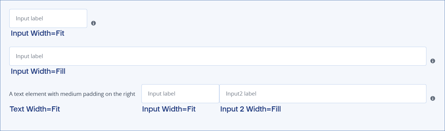
Width=Fill examples
In all three examples, the tooltip container element expands to the maximum width available. Although, only in examples 2 and 3, where a contained element does the same, is this evident. In the first example, the tooltip
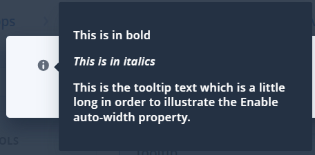
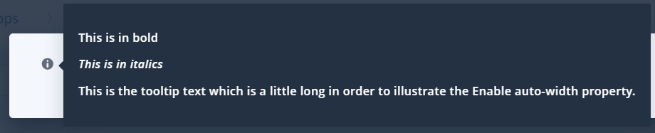
Auto-width examples
Note
In these examples, the Enable markdown property is also enabled.
Auto-width disabled
Auto-width enabled
In this section