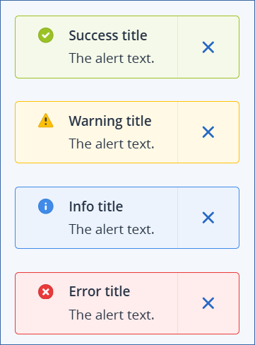
Alert
This element is a colored block with an admonition that requires user attention. The alert admonition text can contain plain text or text in markdown format.
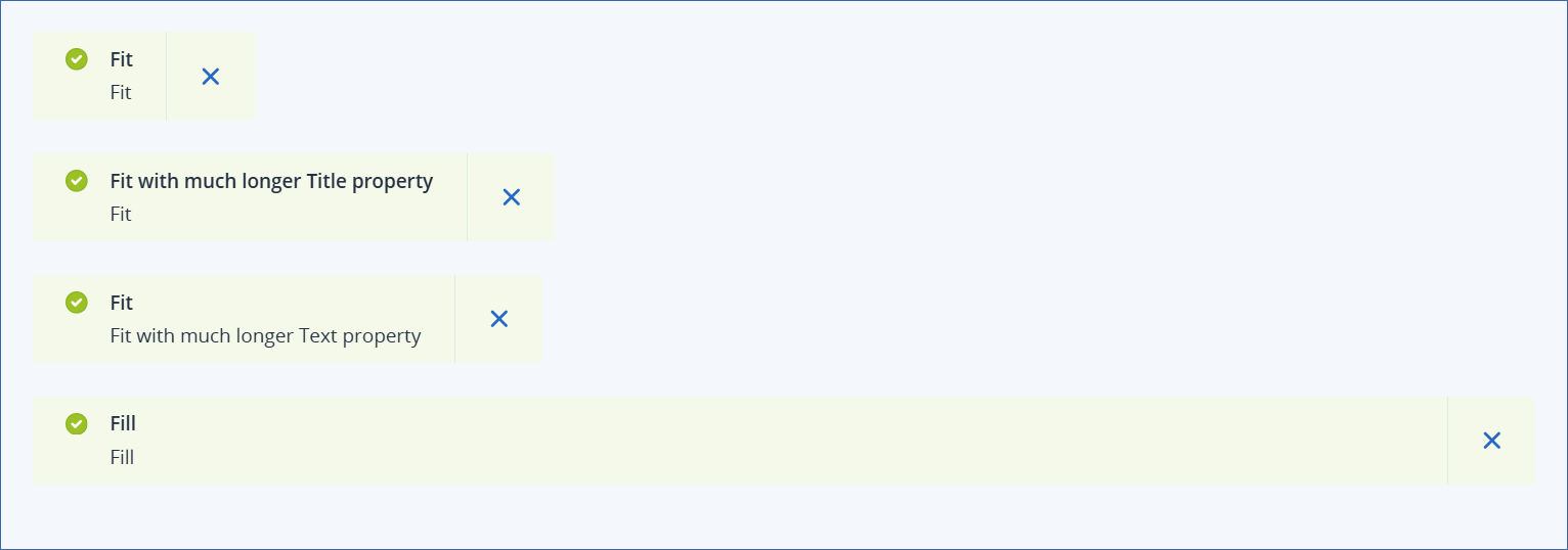
Properties
Width (see examples)
Note
For more information on markdown syntax, including variable substitution, see UI builder element markdown.
Examples
Width examples
Type examples
Enable border examples