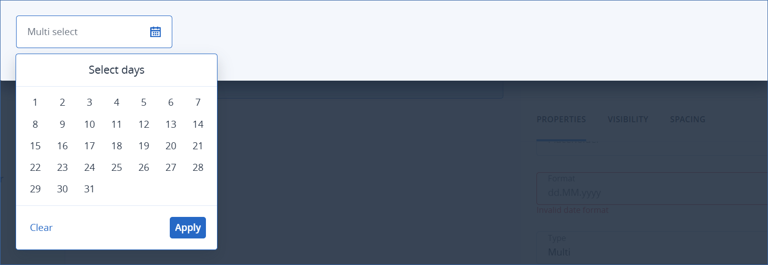
Date picker element
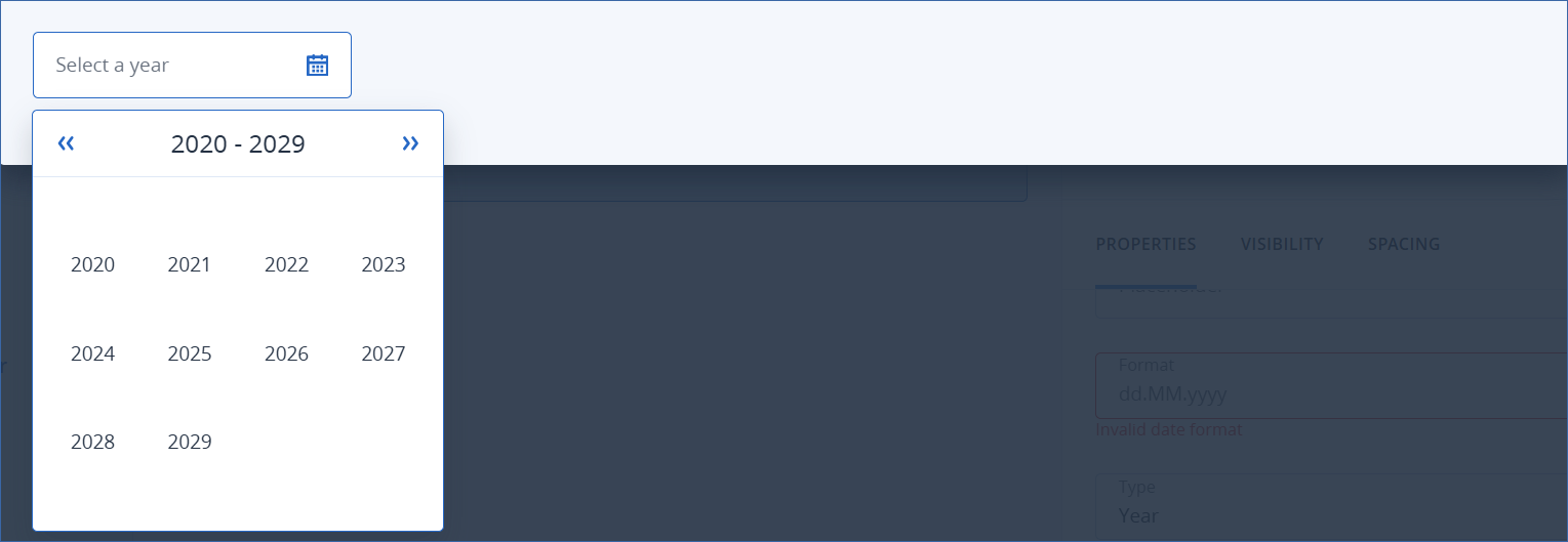
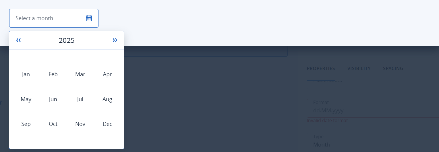
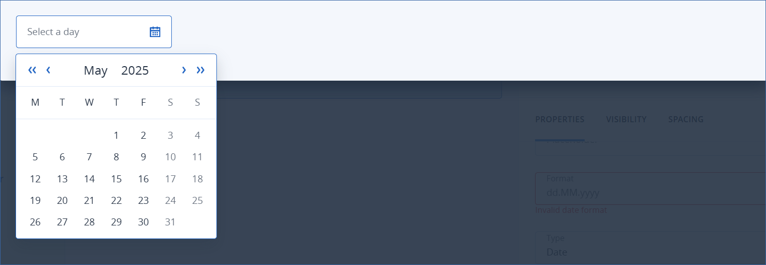
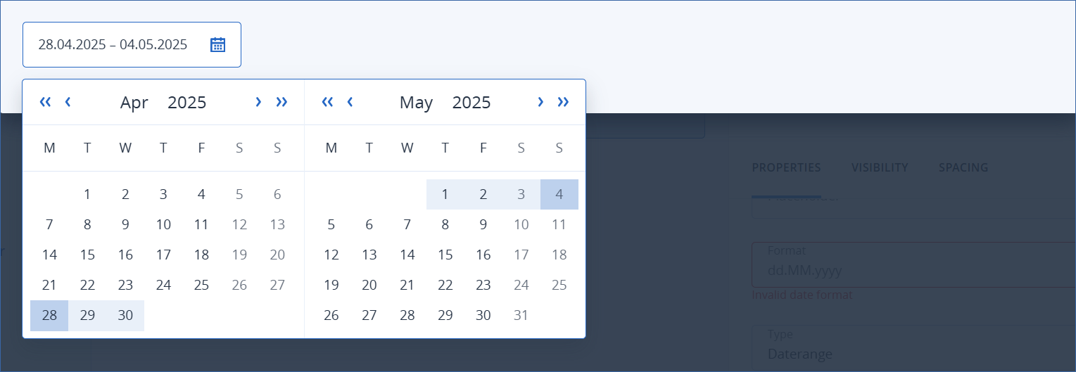
This element provides a calendar to pick a year, a month, a date, a range of dates, or a selection of dates.
Note
This element is not available in the CyberApp enablement form or the Customer enablement form.
Properties
IDElement identifier. LabelLabel, displayed inside the element. If the label text is too long to fit completely in the element, it is truncated.
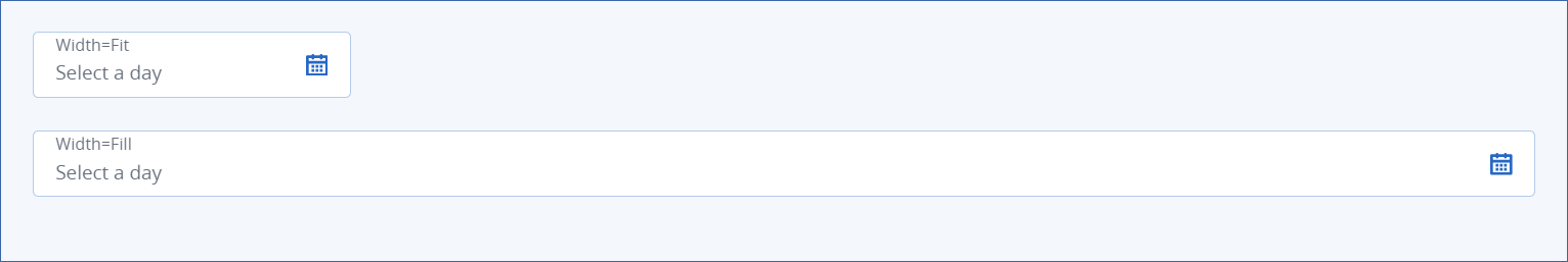
Width (see examples)
FitSets the width to default. PlaceholderAn optional text, displayed when the user has not yet selected any dates, to hint what date or dates the user should select.If the placeholder text is longer than the element can accomodate, it is truncated. FormatFormat of the date, according to ISO 8601.Default is dd.MM.yyyy. Type (see examples)Type of date picker.
YearUsers select the year. (The 1st of January of that year is the returned value.) MonthUsers select the month. (The 1st of the month of the specified year is the returned value.) Date (default)Users select a specific date. DaterangeUsers must select a start and an end date. MultiUsers can select multiple days of the month. Min. date[Optional] The earliest date that can be specified in the date picker.This property is incompatible with the Multi date picker type. Max. date[Optional] The latest date that can be specified in the date picker.This property is incompatible with the Multi date picker type.Size
Default Small (default)Note
For this element, the Size property has no effect.
Examples
Width examples

Type examples


