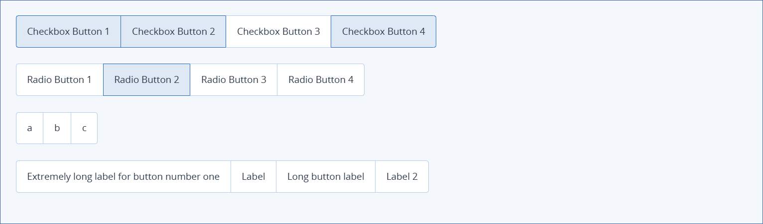
Button group element
This element is a group of buttons that can be used to select different options. The buttons in the button group are sized according to the Label text.
Properties
Note
This property is only available in the CyberApp enablement form and the Customer enablement form.
Connection settings indicates that this information will be sent to the ISV servers but does not need to uniquely identify a user and is not sensitive information that must be stored and sent in a special way.
Width
Type
To add buttons
Click New button.
Enter a button Label.
Repeat for each button.
[Optional] Click the
and
to reorder the list.
[Optional] Click
to delete a button.
Examples