Tabs container
Properties
Width (see examples)
Populating a tab container
To populate a tab container
Click
 .
.- From the Form name dropdown, select a form.You can select any form in the form group with the exception of the root form.
[Optional] Enter a Title for the tab. If you do not supply a title, the form name is used.
[Optional] Select an icon from the Icon name dropdown. The icon is displayed to the left of the title.
[Optional] Select a color for the icon from the Icon color dropdown.
Note
This option is only available if you selected a monochrome icon on the previous step.
Repeat steps 1 to 5 for each form you want to include in the tabs container.
[Optional] Click the
 and
and  to reorder the tab list.
[Optional] Click
 to delete a tab.
Example
Note
The following example was created prior to the Width property being introduced.
Examples
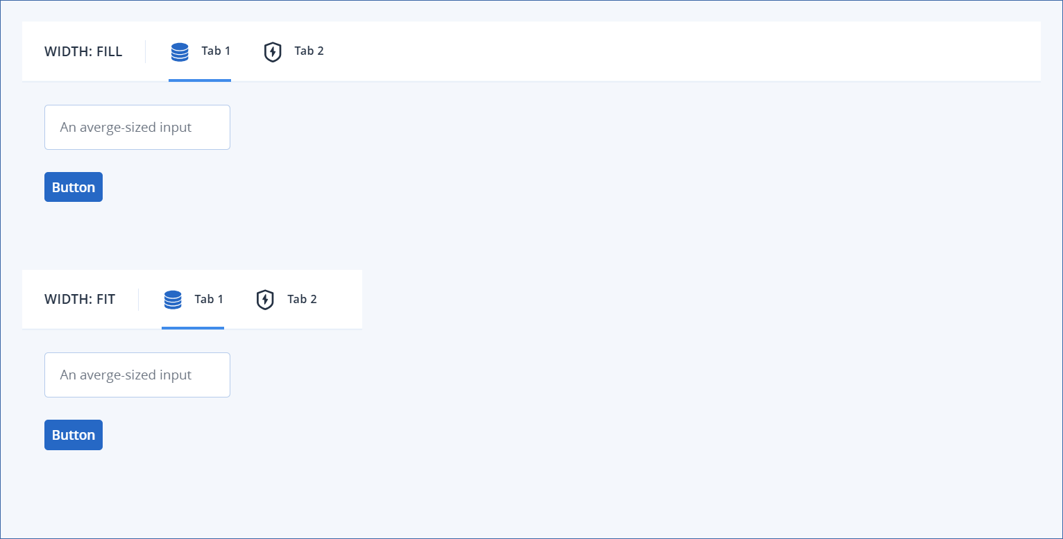
Width examples
In these examples, Tab 1 and Tab 2 both contain forms with elements which have Width properties of Fit. Therefore, when the tab container Width property is also set to Fit, the tab container is sized to accommodate the widest of the two forms. In this case, the width required to accommodate the tab container elements (the title and the 2 tabs) is more than that of either form.
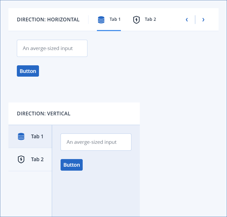
Direction examples
In these examples, the tab containers are identical apart from the Direction property. The tab containers are Width: Fit and both tabs 1 and 2 contain forms with only Width: Fit elements. Therefore, both tab containers are sized to accommodate the widest of the two forms, or the combination of the tab container elements (whichever is longer). Since the DIRECTION: VERTICAL tab container does not need to accommodate the tab titles and icons in its width, it is not as wide as the DIRECTION: HORIZONTAL tab container.